Charts
Visualize time-series data with line charts, bar charts, heatmaps, and more. Supports real-time updates, data comparison, filtering, and CSV export.
Charts are the primary visualization tool in Exosphere for monitoring and analyzing Miniserver data over time. Create custom visualizations from any control or sensor, compare periods, and export data for further analysis.
Use Cases
Charts help you answer questions like:
- Energy monitoring – How much energy did we consume this month compared to last year?
- Temperature tracking – What's the temperature pattern in the server room over 24 hours?
- Peak analysis – When do we experience peak power loads?
- Consumption comparison – Which rooms consume the most energy?
- Trend analysis – Is our energy usage increasing or decreasing over time?
Getting Started
New to charts? Follow this quick path:
- Create your first chart – Start with a simple line chart
- Add data series – Select sensors to visualize
- Adjust the time range – Choose day, week, or month view
- Save and add to dashboard – Combine charts for monitoring
Start simple with a single sensor and one chart type. Once comfortable, explore period comparisons and data filters.
Chart Types
Exosphere offers multiple chart types organized into three categories based on their use case.
Live Charts (Real-Time Values)
Live charts display current or recent values, ideal for monitoring dashboards.
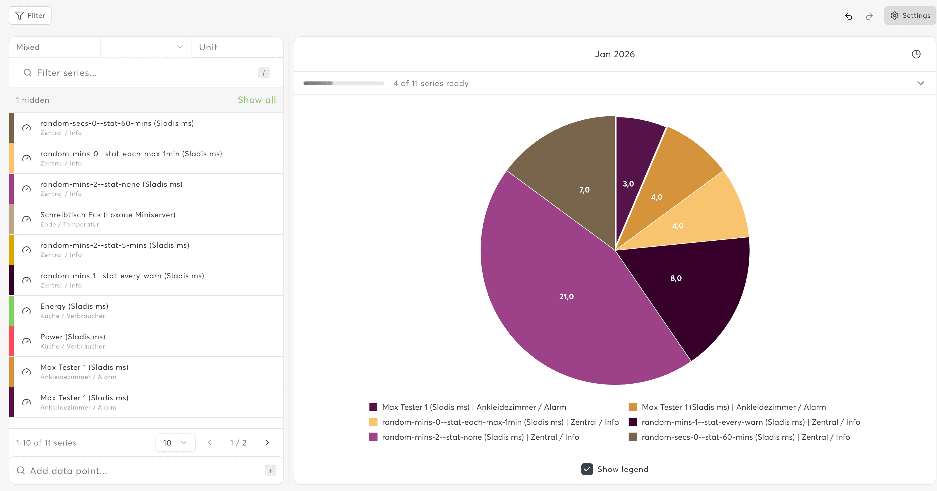
Pie Chart
Distribution visualization showing proportional values as slices.
- Best for: Market share, category breakdowns, percentage distributions
- Data source: Uses the last recorded value for each series
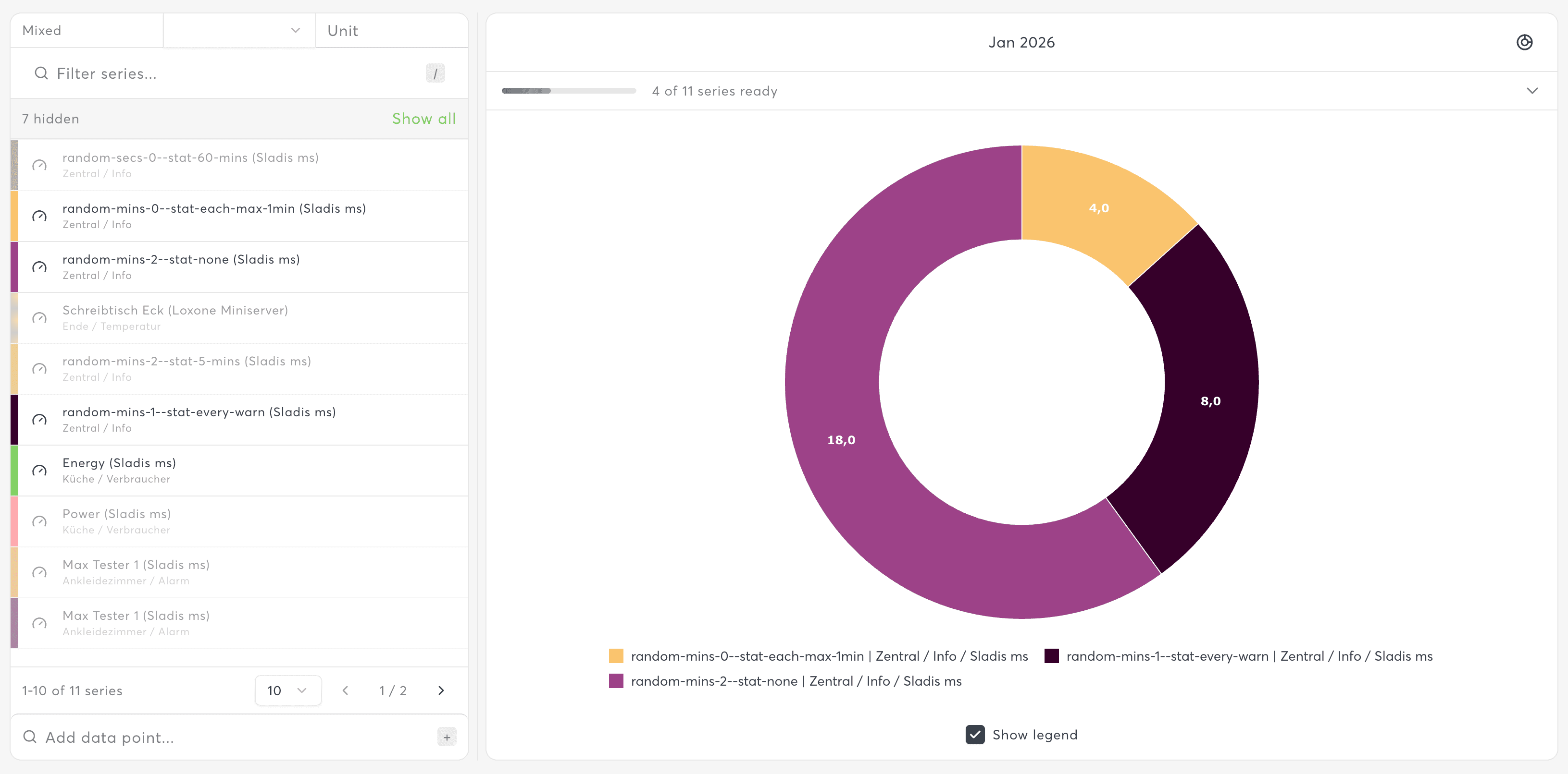
Donut Chart
Similar to pie chart with a center hole, often used to display a summary value.
- Best for: Same as pie charts, with space for additional context in center
- Supports: Custom center content display
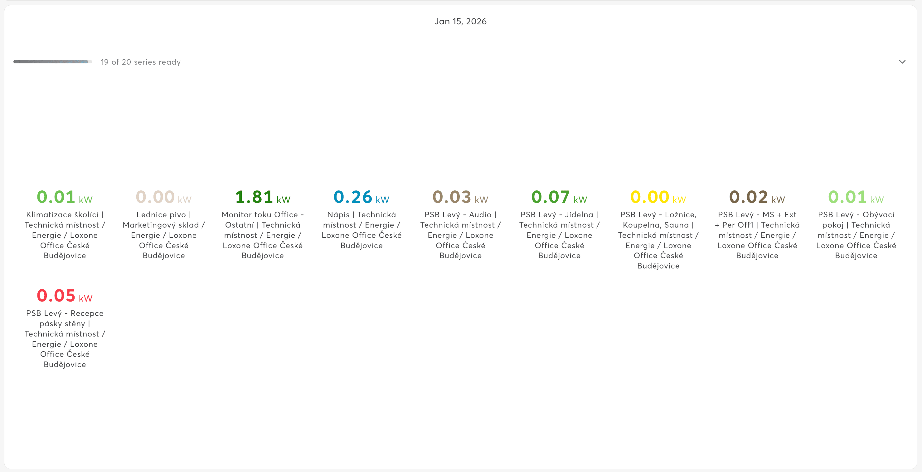
Stat Chart
Large numeric values displayed in a responsive grid layout.
- Best for: KPI displays, quick status overview, dashboard headers
- Supports: Multiple values in grid arrangement
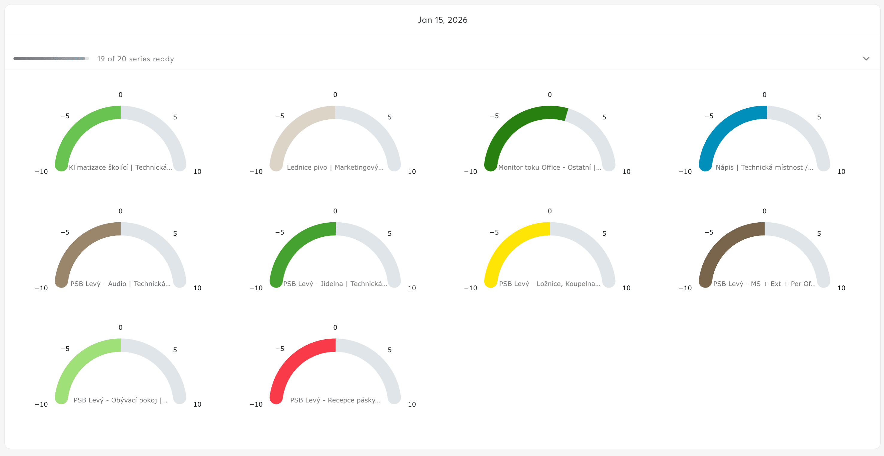
Gauge Chart
Radial gauge visualization for single values against a scale.
- Best for: Temperature, pressure, fill levels, any value with min/max range
- Supports: Custom scale ranges, threshold indicators
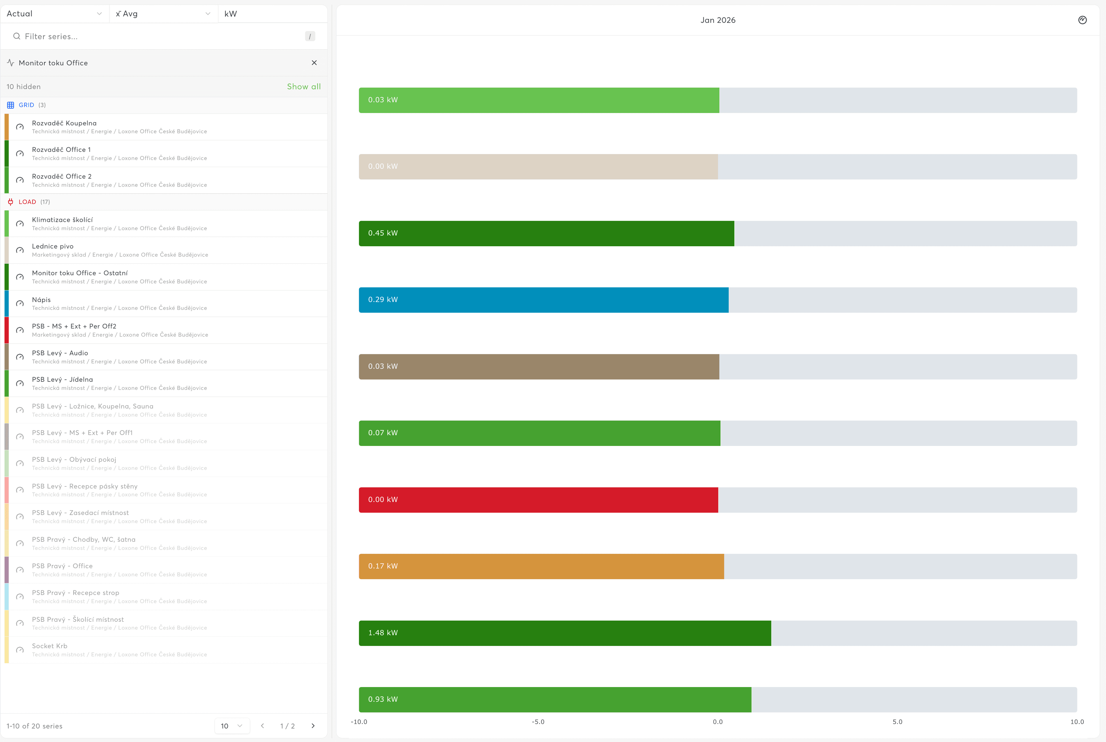
Bar Gauge
Linear horizontal or vertical gauge bars.
- Best for: Comparing multiple current values side-by-side
- Supports: Horizontal and vertical orientations
Trend Charts (Time Series)
Trend charts display data changes over time, essential for historical analysis.
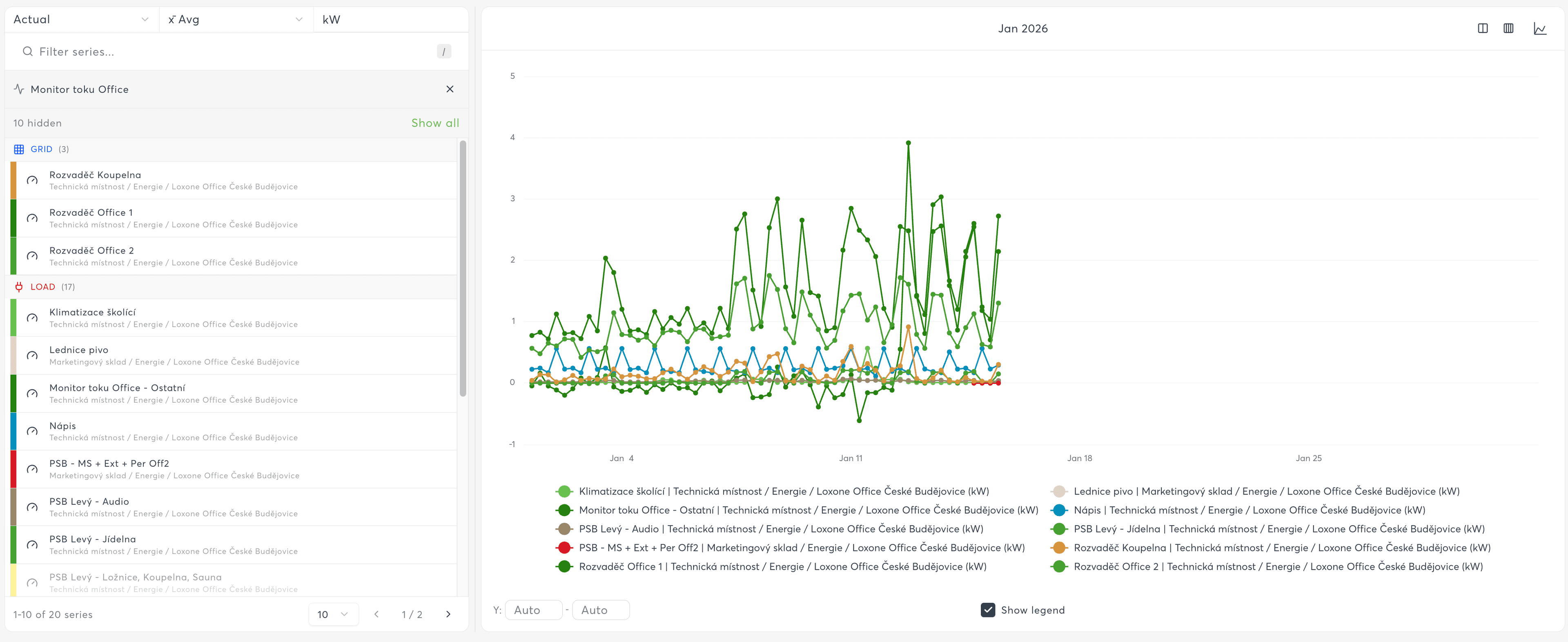
Line Chart
Standard time series visualization connecting data points with lines.
- Best for: Temperature trends, energy consumption over time, continuous sensors
- Supports: Multiple series, various interpolation modes, area fills
- Interpolation options: Linear, Smooth, Step-start, Step-middle, Step-end
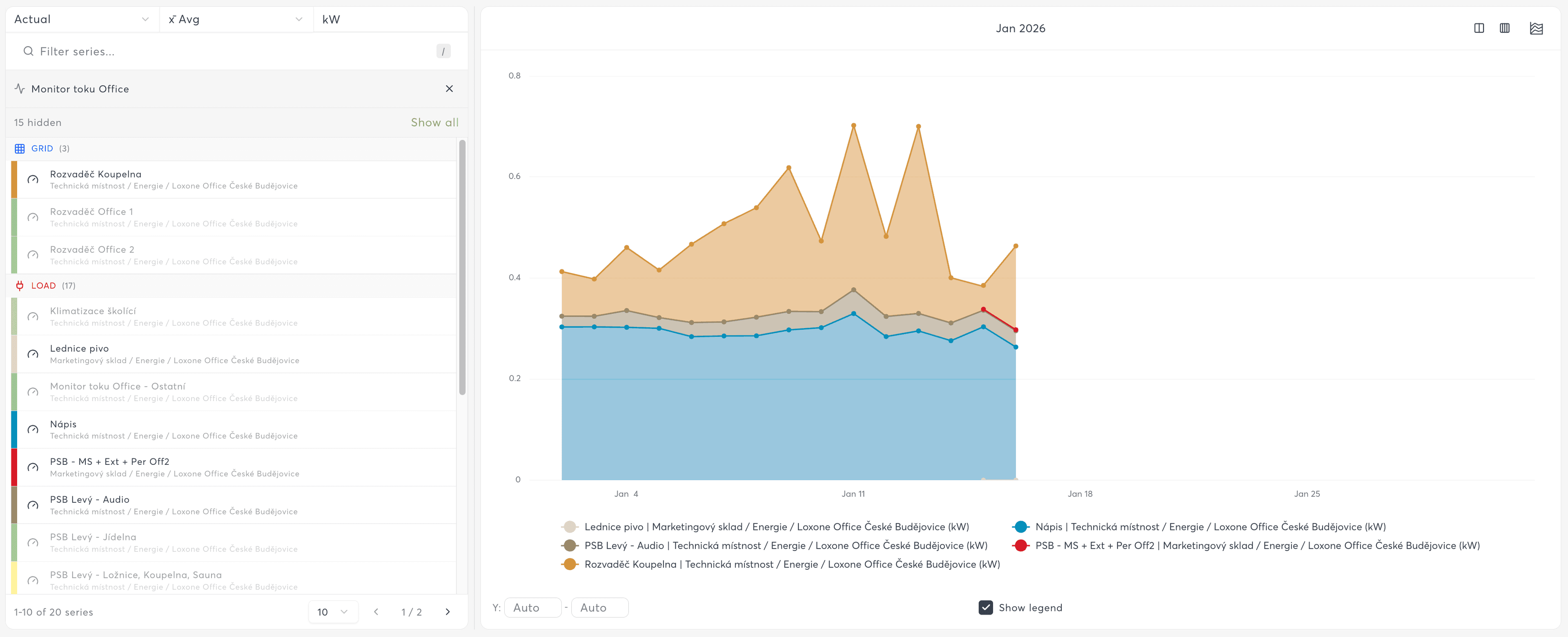
Area Chart
Filled area under the line, useful for showing volume or cumulative data.
- Best for: Cumulative values, part-to-whole relationships, stacked comparisons
- Supports: Stacking (absolute or normalized to 100%)
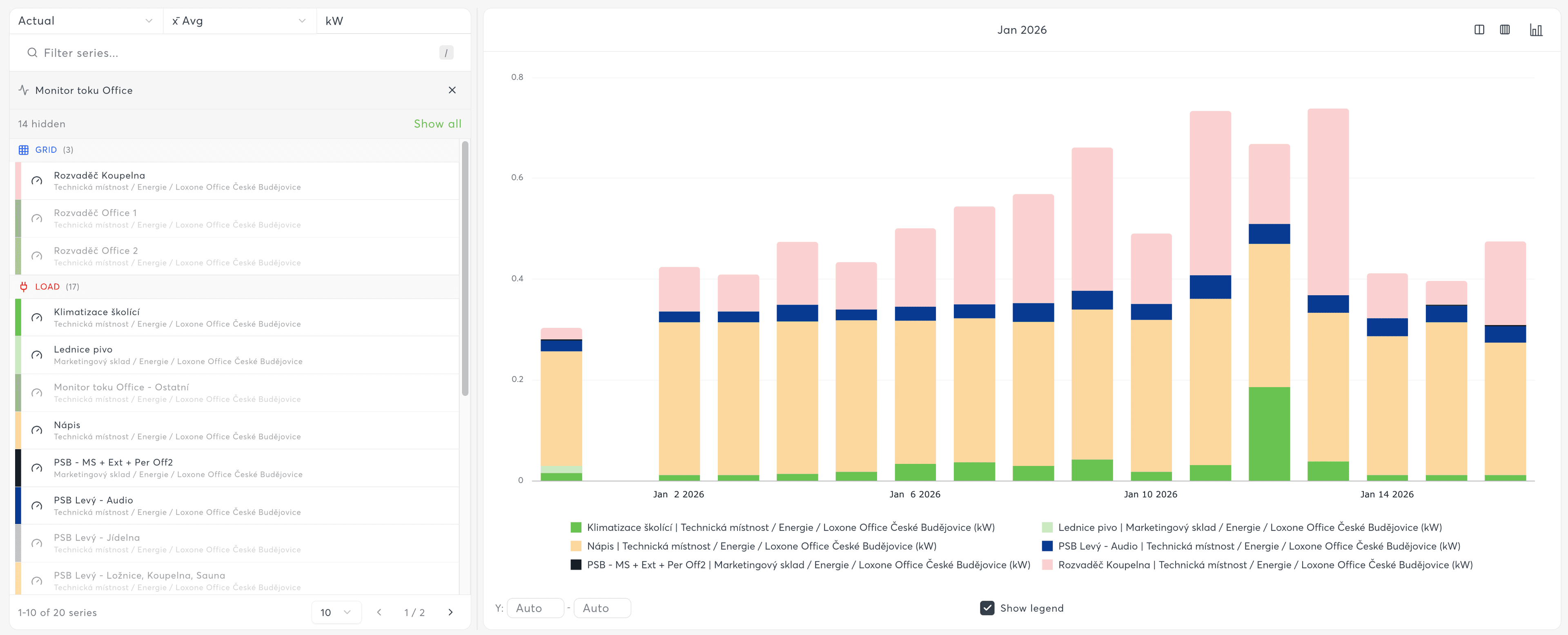
Bar Chart
Vertical bars for time-bucketed data comparisons.
- Best for: Daily/weekly/monthly consumption, event counts, periodic comparisons
- Supports: Stacking, grouped bars, navigator for large datasets
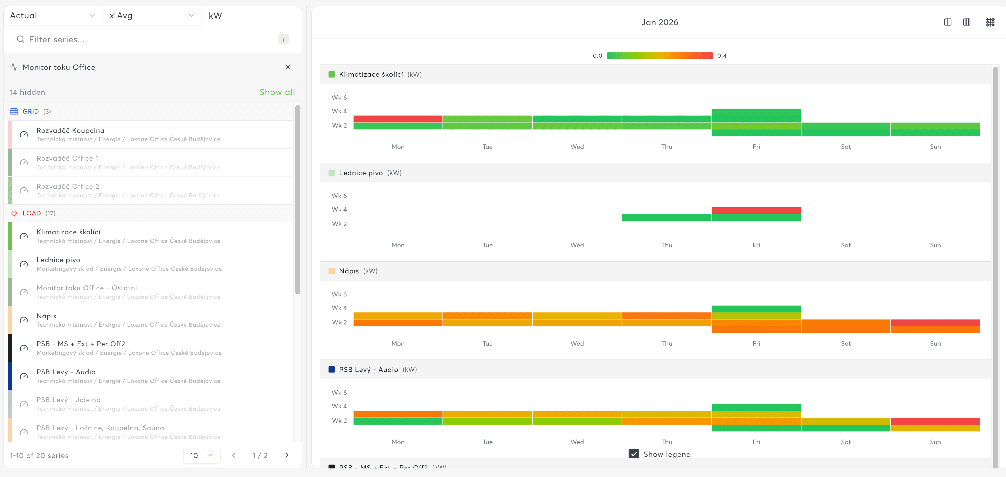
Heatmap Chart
Pattern visualization showing intensity across two dimensions.
- Weekly view: Hour of day (Y-axis) vs. day of week (X-axis)
- Monthly view: Day of month (Y-axis) vs. week (X-axis)
- Best for: Usage patterns, occupancy analysis, identifying peak times
Analytics Charts
Analytics charts help identify relationships, rankings, and tabular views.
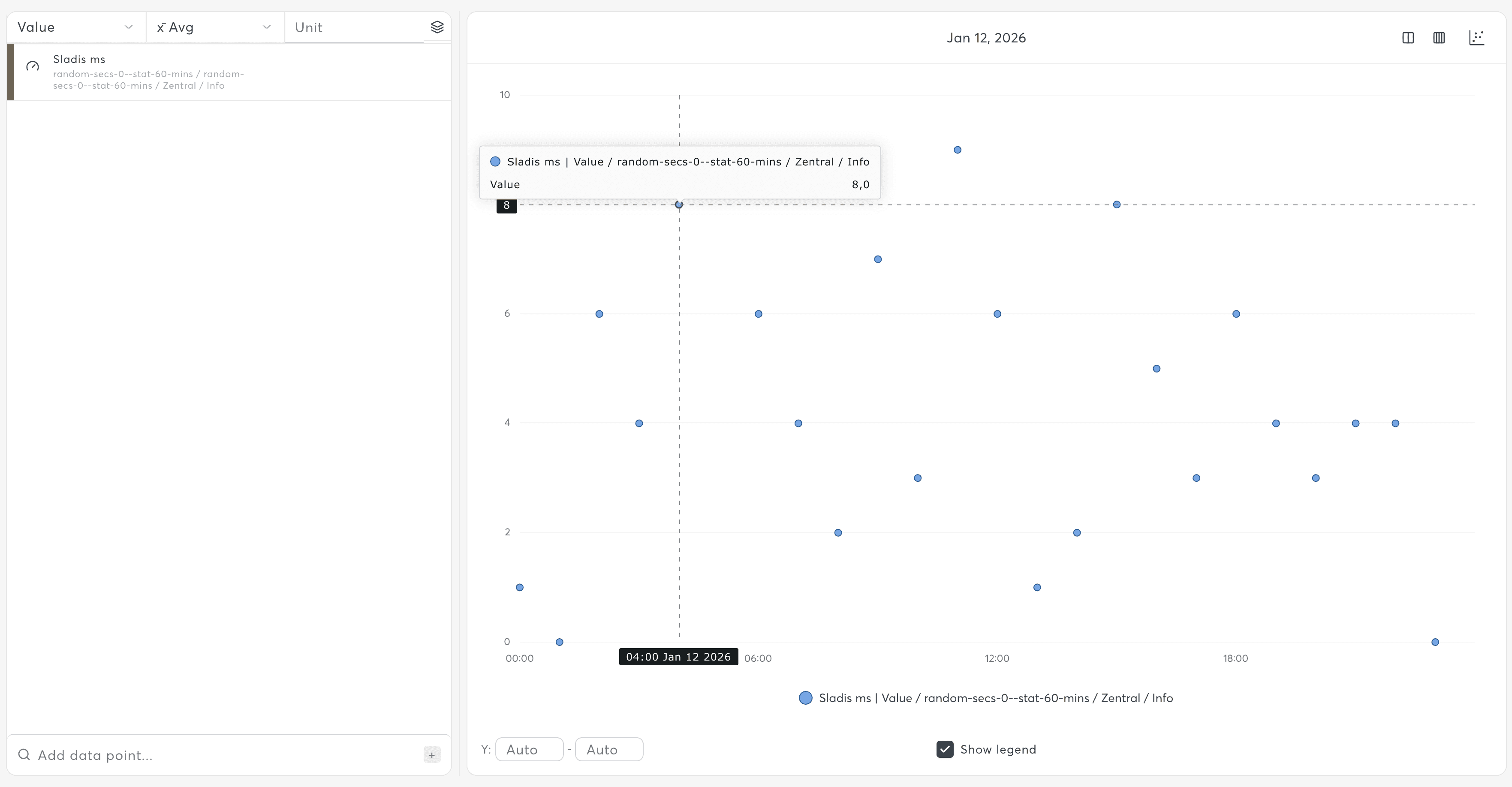
Scatter Chart
Time-series scatter visualization showing individual data points over time.
- Best for: Identifying patterns, outlier detection, sparse data visualization
- Supports: Multiple series with different markers
Box Chart
Statistical distribution visualization showing median, quartiles, and outliers.
- Best for: Comparing value distributions across categories or time periods
- Supports: Whisker plots, outlier markers
Correlation Chart
Two-variable relationship visualization plotting one sensor against another.
- Best for: Identifying relationships between variables (e.g., temperature vs. energy consumption)
- Supports: Multiple series, trend lines
Ranking Chart
Horizontal bar chart sorted by value, showing top/bottom performers.
- Best for: Top consumers, highest temperatures, performance rankings
- Automatically sorted: Descending order by aggregated value
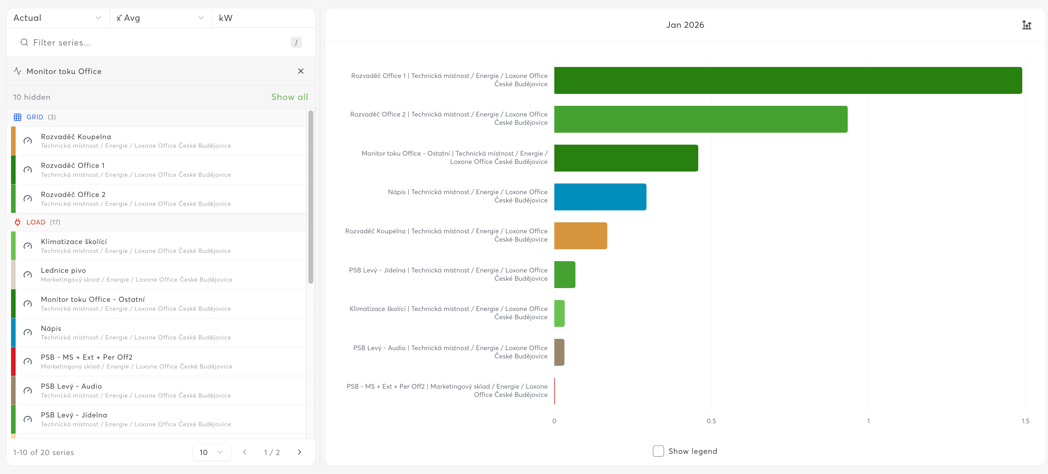
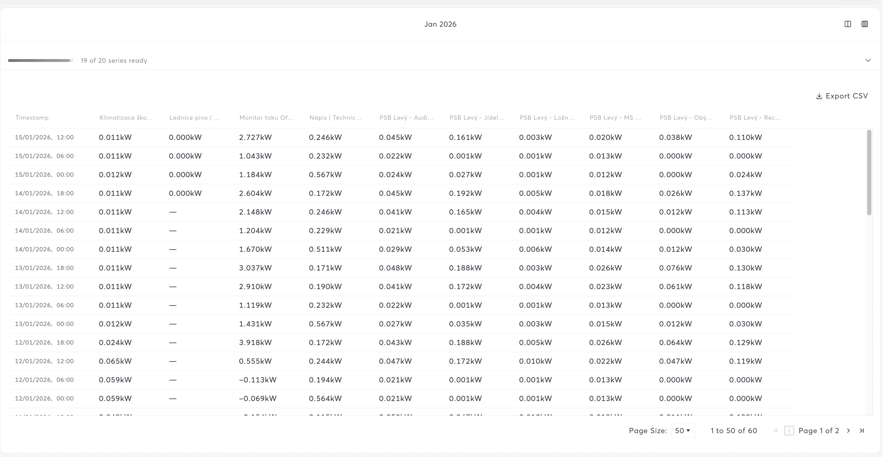
Table Chart
Tabular data display with sorting, filtering, and export capabilities.
- Best for: Detailed data inspection, raw value access, data export
- Supports: Pagination, column sorting, CSV export
Energy Charts
Specialized charts for energy monitoring and analysis.
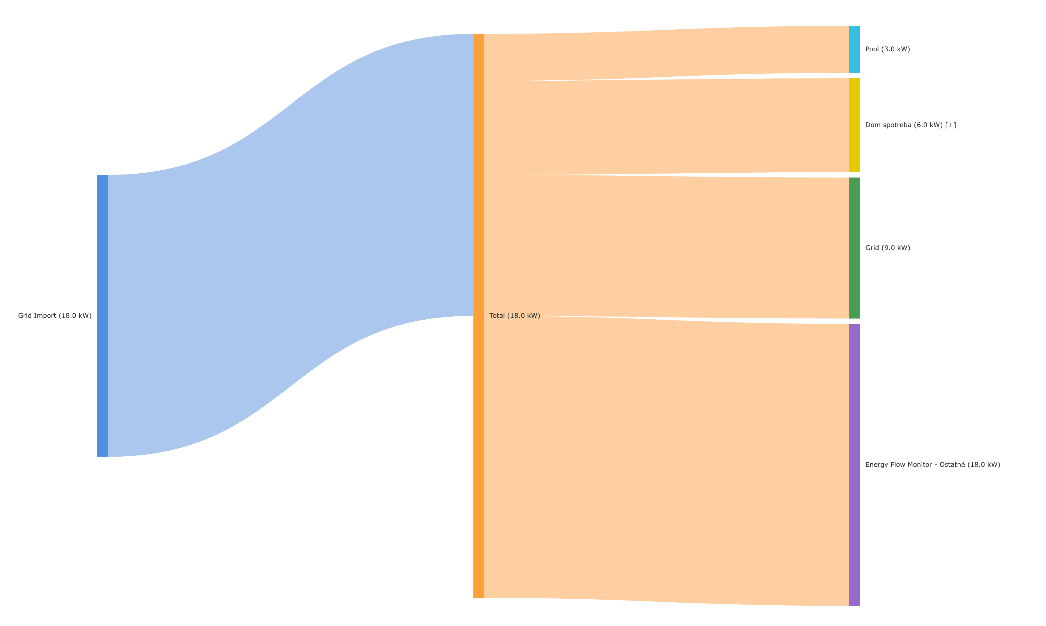
Sankey Chart (Energy Flow)
Flow visualization showing energy distribution through a system.
- Best for: Energy Flow Monitor (EFM) controls, power distribution analysis
- Supports: Expandable/collapsible nodes, power and energy modes
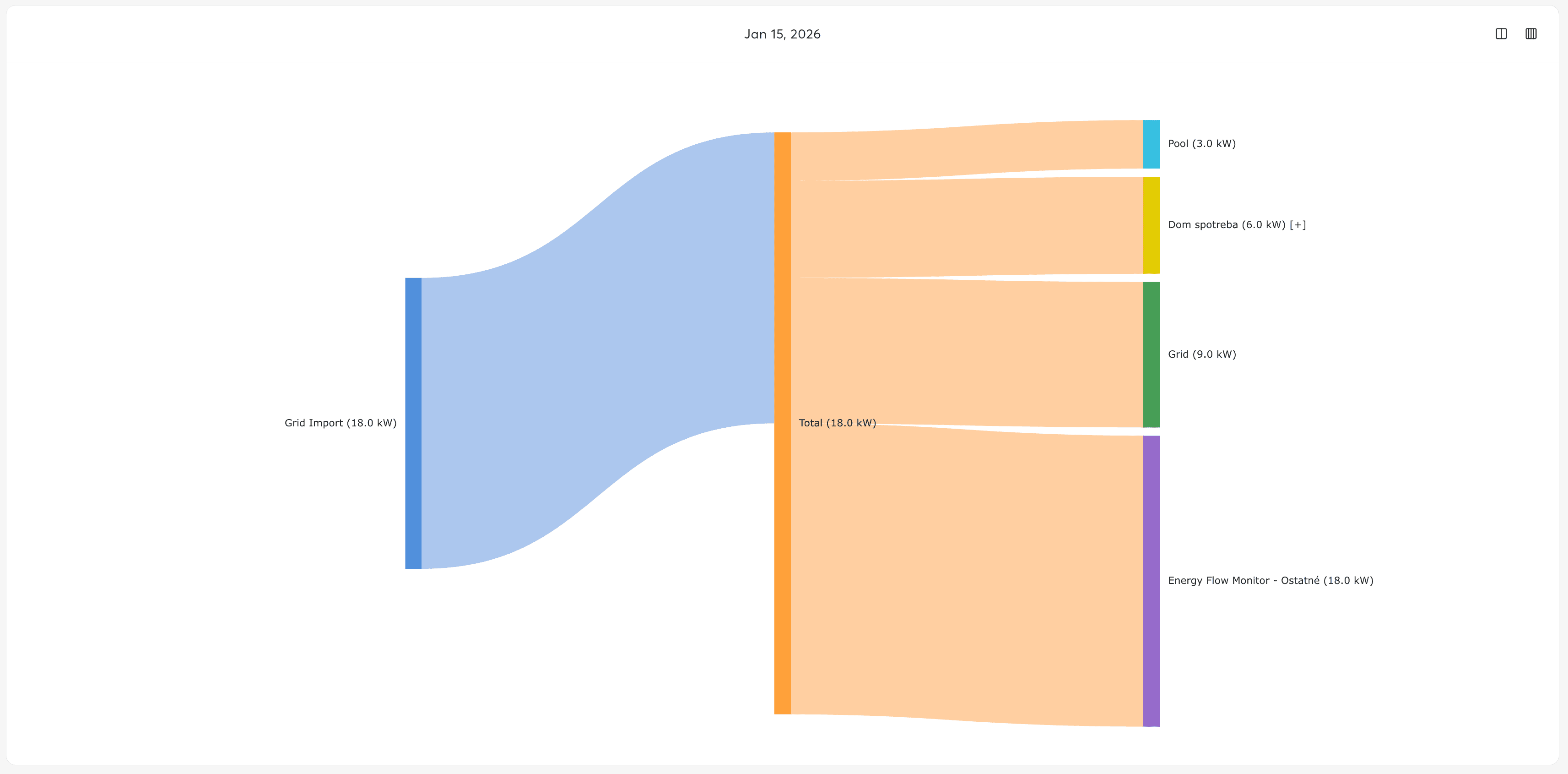
Chart Templates
Exosphere provides pre-configured chart templates to accelerate common use cases. Templates include optimized settings for specific control types.
| Template | Chart Type | Best For | Aggregation |
|---|---|---|---|
| Energy Flow | Sankey | EFM controls, power distribution | - |
| Consumption Analysis | Bar | Meter readings over time | Average |
| Top Consumers | Ranking | Identifying highest usage | Sum |
| Consumption | Bar | Total energy per period | Sum |
| Load | Line | Current power draw | Average |
| Base Load | Area | Minimum power baseline | Min |
| Peak Load | Line | Maximum power peaks | Max |
| Prices | Line | Energy price tracking | Average |
| Temperatures | Line | Room controller data | Average |
Use templates when creating charts from dashboard panels to quickly configure common visualizations without manual setup.
Creating a Chart
Quick Start
- Navigate to Analytics → Charts
- Click "New Chart"
- Enter a chart name
- Click "+" or press the + key to open the sensor search
- Search and select sensors to add to the chart
- Adjust time range using the toolbar controls
- Click Save
Adding Data Series
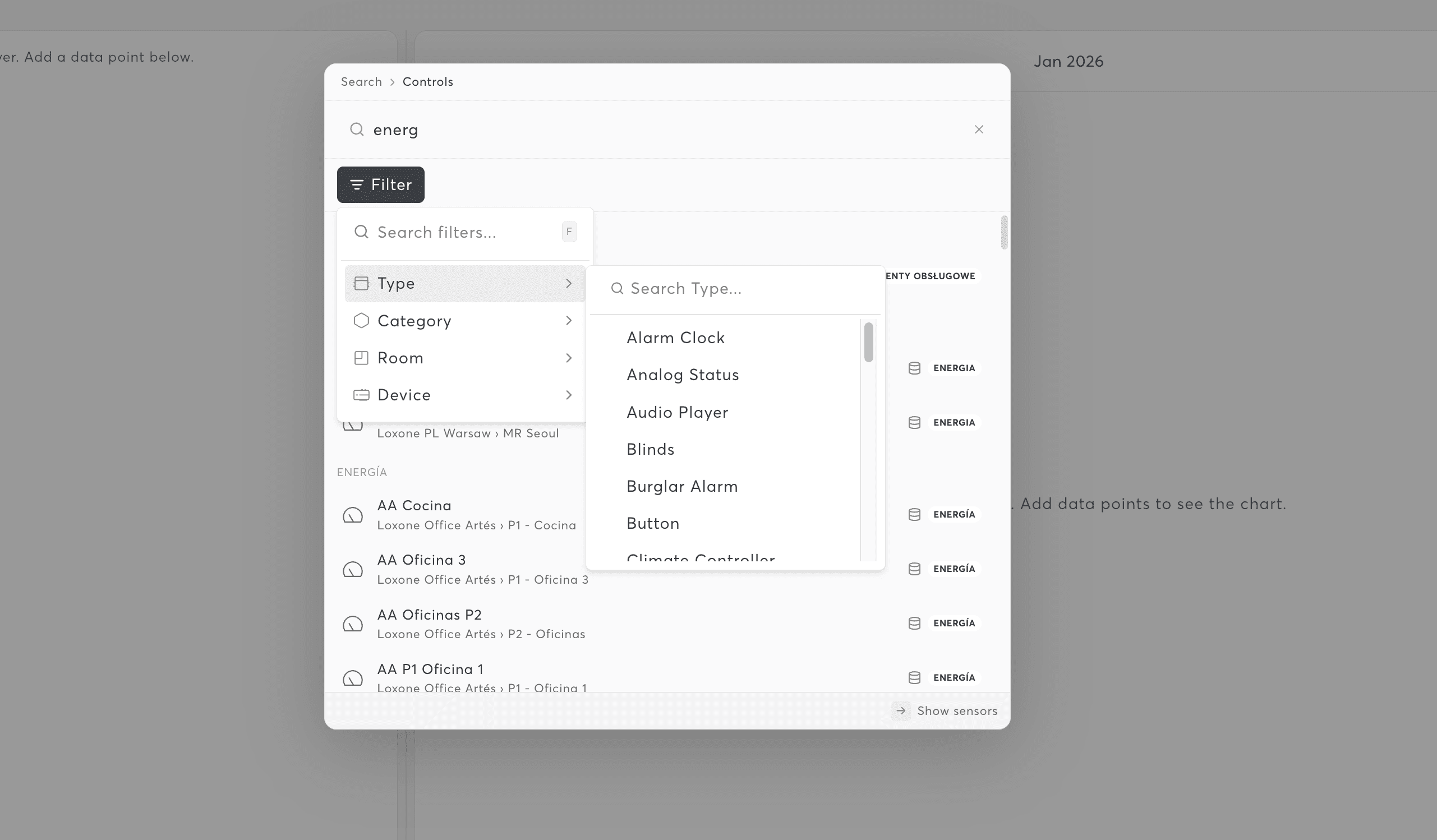
Using the Sensor Search
- Click the "+" button or press + on your keyboard
- The sensor search palette opens
- Type to search by sensor name, control type, or device
- Click sensors to add them to the chart
- Multiple sensors can be added in one session
Data Source Types
Charts support multiple data source configurations:
| Source Type | Description | Use Case |
|---|---|---|
| Static Source | Explicit sensor selection | Specific sensors you want to track |
| SmartSet Source | Dynamic from Control Sets | Automatically includes sensors matching criteria |
| Mixed Source | Combination of static and SmartSets | Flexible hybrid approach |
| EFM Source | Energy Flow Monitor | Automatically populates sub-controls for power/energy |
For EFM (Energy Flow Monitor) controls, you can switch between Power mode (actual kW values) and Energy mode (total/totalNeg kWh values) using the sensor type preference.
Managing Series
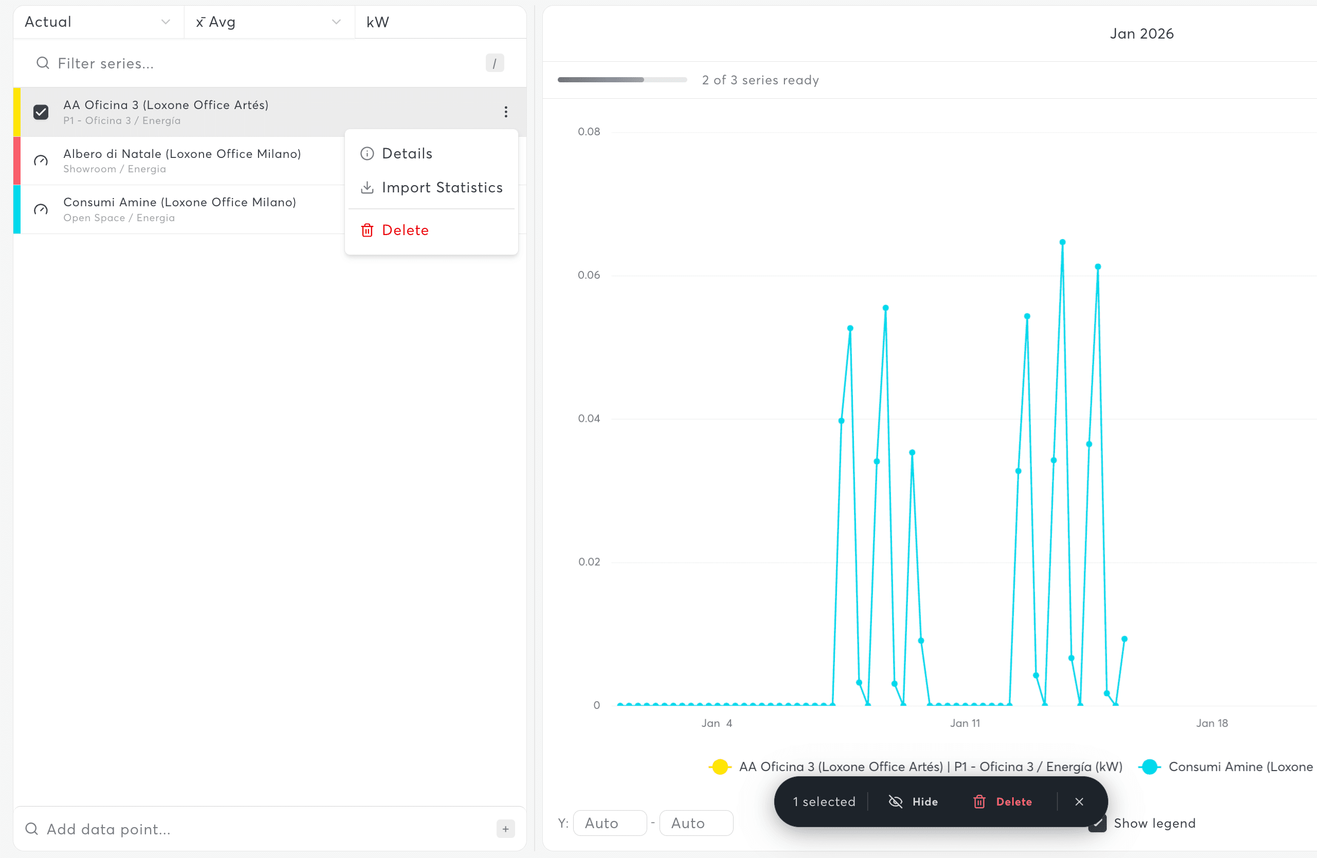
Series List
The series panel shows all data sources in your chart:
- Toggle visibility – Click the eye icon to show/hide series
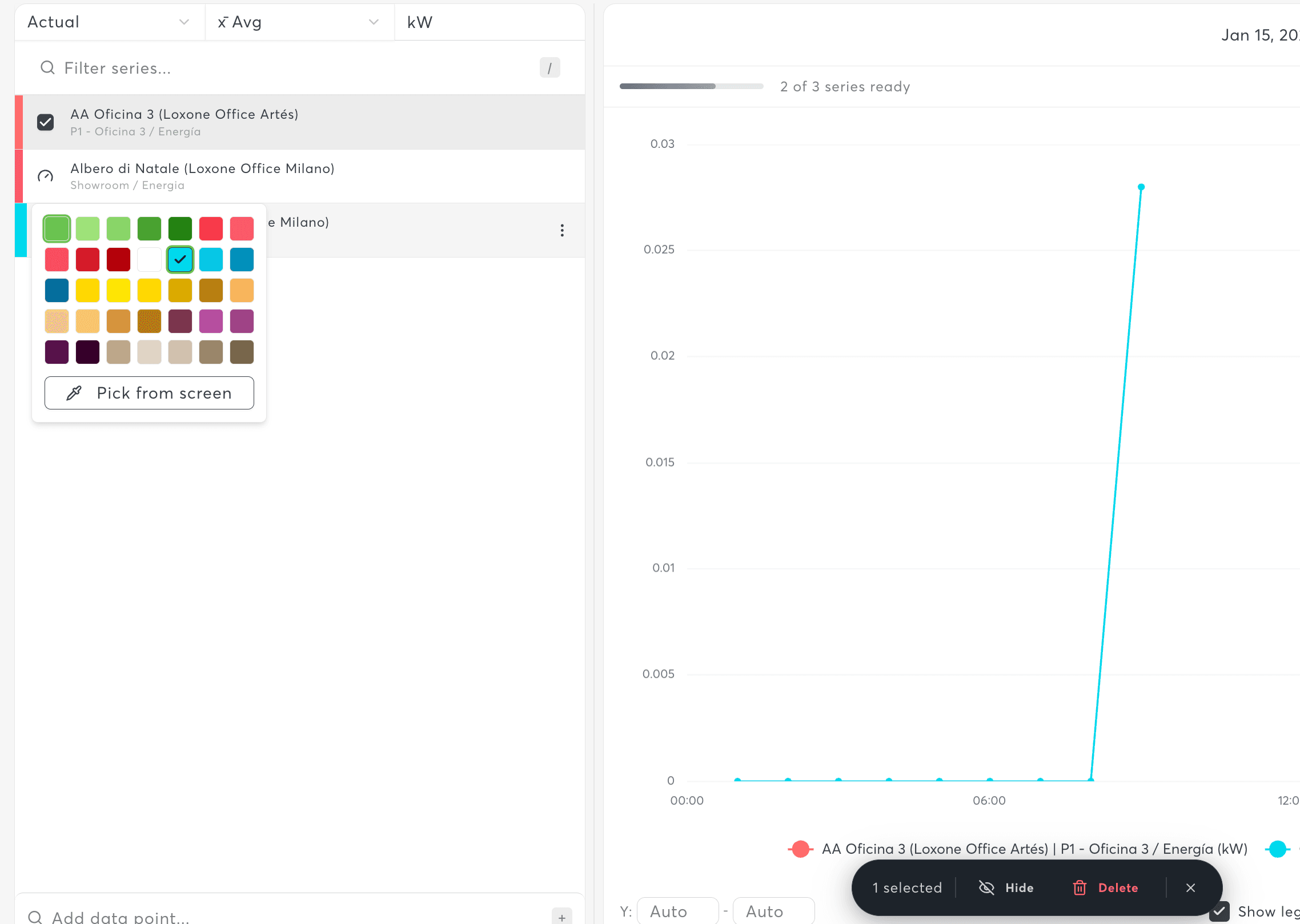
- Change color – Click the color swatch to select a new color
- Reorder – Drag series to change display order
- Remove – Click the X to remove a series
- Filter – Use the search box to find specific series
Pagination for Large Charts
When charts have many series, pagination keeps the interface manageable:
- Page sizes: 5, 10, 25, or 50 series per page
- Navigate between pages using the pagination controls
- Series filter applies across all pages
For better readability, keep charts to 5-8 series maximum. If you need more, consider creating multiple focused charts and combining them in a dashboard.
Time Range Selection
Bucket Sizes (Time Window)
The bucket determines the overall time period displayed:
| Bucket | Description | Example |
|---|---|---|
| 1 Hour (1h) | Last 60 minutes | Current hour monitoring |
| 1 Day (1d) | Last 24 hours | Daily patterns |
| 1 Week (1w) | Last 7 days | Weekly trends |
| 1 Month (1mo) | Last 30/31 days | Monthly overview |
| 1 Quarter (1q) | Last 3 months | Quarterly analysis |
| 1 Year (1y) | Last 12 months | Annual comparison |
Resolution (Data Granularity)
Resolution controls how data points are aggregated:
| Resolution | Best For |
|---|---|
| 1 minute (1m) | Real-time monitoring, last hour |
| 15 minutes (15m) | Intraday patterns, last day |
| 1 hour (1h) | Daily trends, last week |
| 6 hours (6h) | Weekly overview |
| 1 day (1d) | Monthly patterns |
| 1 week (1w) | Quarterly trends |
| 1 month (1mo) | Yearly trends |
| 1 quarter (1q) | Multi-year comparisons |
| 1 year (1y) | Long-term historical analysis |
Time Navigation
- Previous/Next – Arrow buttons shift the time window
- Zoom In/Out – Adjust resolution for more/less detail
Performance tip: For time ranges longer than 7 days, use hourly resolution or lower to keep charts responsive. High resolution over long periods creates many data points that slow down rendering.
Chart Customization
Color Configuration
Color Palettes
Choose from three built-in color palettes:
| Palette | Description | Best For |
|---|---|---|
| Distinctive | High contrast, easily distinguishable | Many series, accessibility |
| Elegant | Brand-aligned, curated shades | Professional presentations |
| Uniform | Single accent color for all series | Cohesive, minimalist look |
Custom Series Colors
Override individual series colors:
- Click the color swatch next to a series name
- Select from the 56-color palette (7 base colors with variations)
- Color persists with the chart
Y-Axis Configuration
Configure the Y-axis for precise data display:
| Setting | Options | Description |
|---|---|---|
| Position | Left / Right | Which side of the chart |
| Scale | Linear / Logarithmic | Standard or log scale for wide ranges |
| Min/Max | Auto / Custom | Automatic range or fixed values |
| Unit Override | Custom text | Display different unit than source |
Multi-Frame Support (Multiple Y-Axes)
Charts can have multiple "frames" with different Y-axes:
- Add a new frame using the frame controls
- Assign series to specific frames
- Each frame can have its own chart type and Y-axis settings
- Use the layer selector to view all layers or focus on specific ones
Interpolation Modes
Control how data points are connected in line/area charts:
| Mode | Description | Use Case |
|---|---|---|
| Linear | Straight lines between points | General purpose |
| Smooth | Curved, spline interpolation | Aesthetic, smoothed trends |
| Step-start | Horizontal line, step at start | Discrete state changes |
| Step-middle | Step in the middle of interval | Centered step display |
| Step-end | Horizontal line, step at end | Value holds until next change |
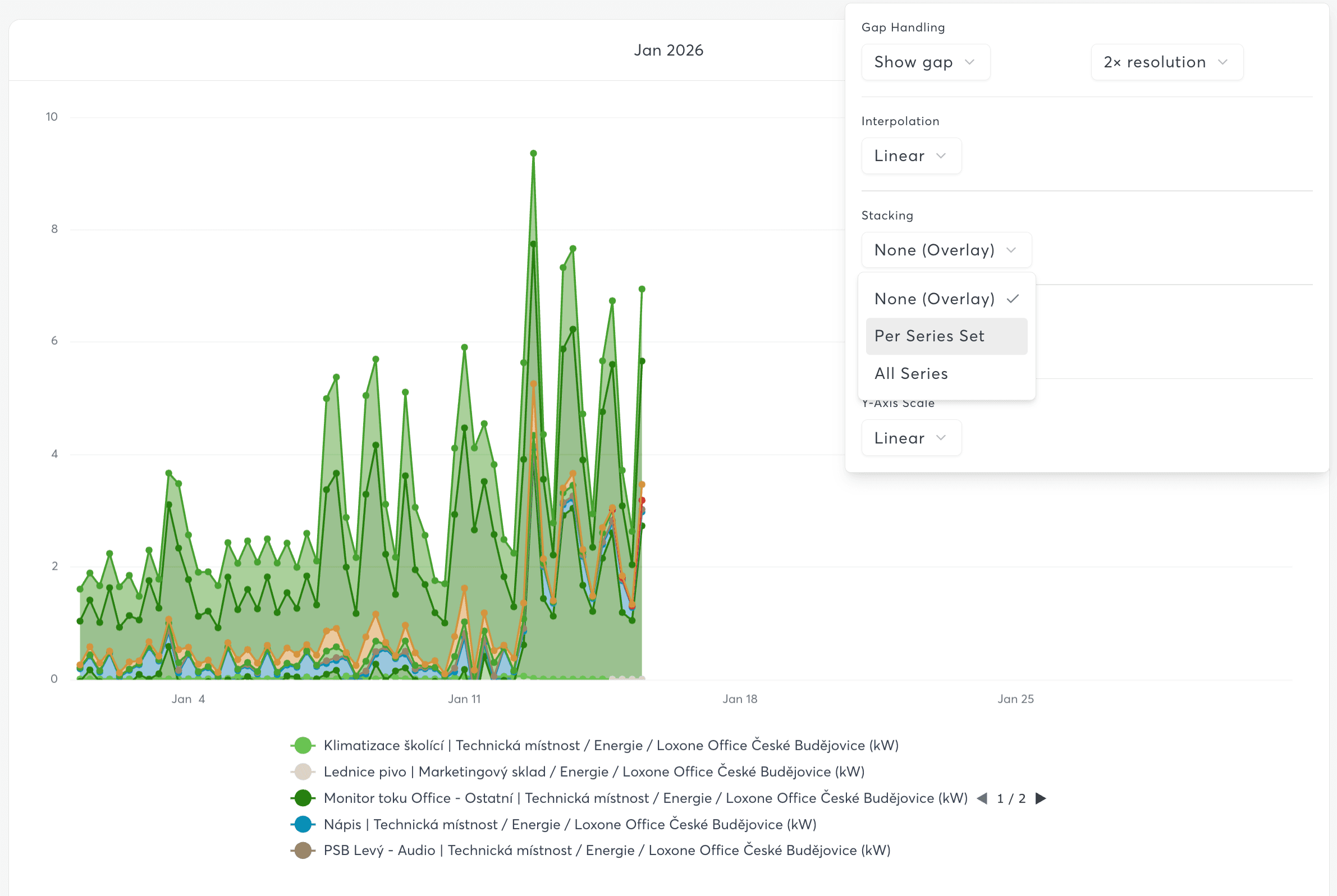
Stacking Options
For area and bar charts, configure how series are stacked:
Stacking Scope:
- None (Overlay) – Series overlap, independent scales
- Per Series Set – Stack within defined groups
- All Series – Single stack with all series
Stacking Mode:
- None – No stacking
- Absolute – Stack values, show totals
- Normalize to 100% – Show percentage contribution
Use Normalize to 100% stacking to see relative contribution of each series, regardless of absolute values. This is useful for comparing category proportions over time.
Analysis Features
Benchmark Lines
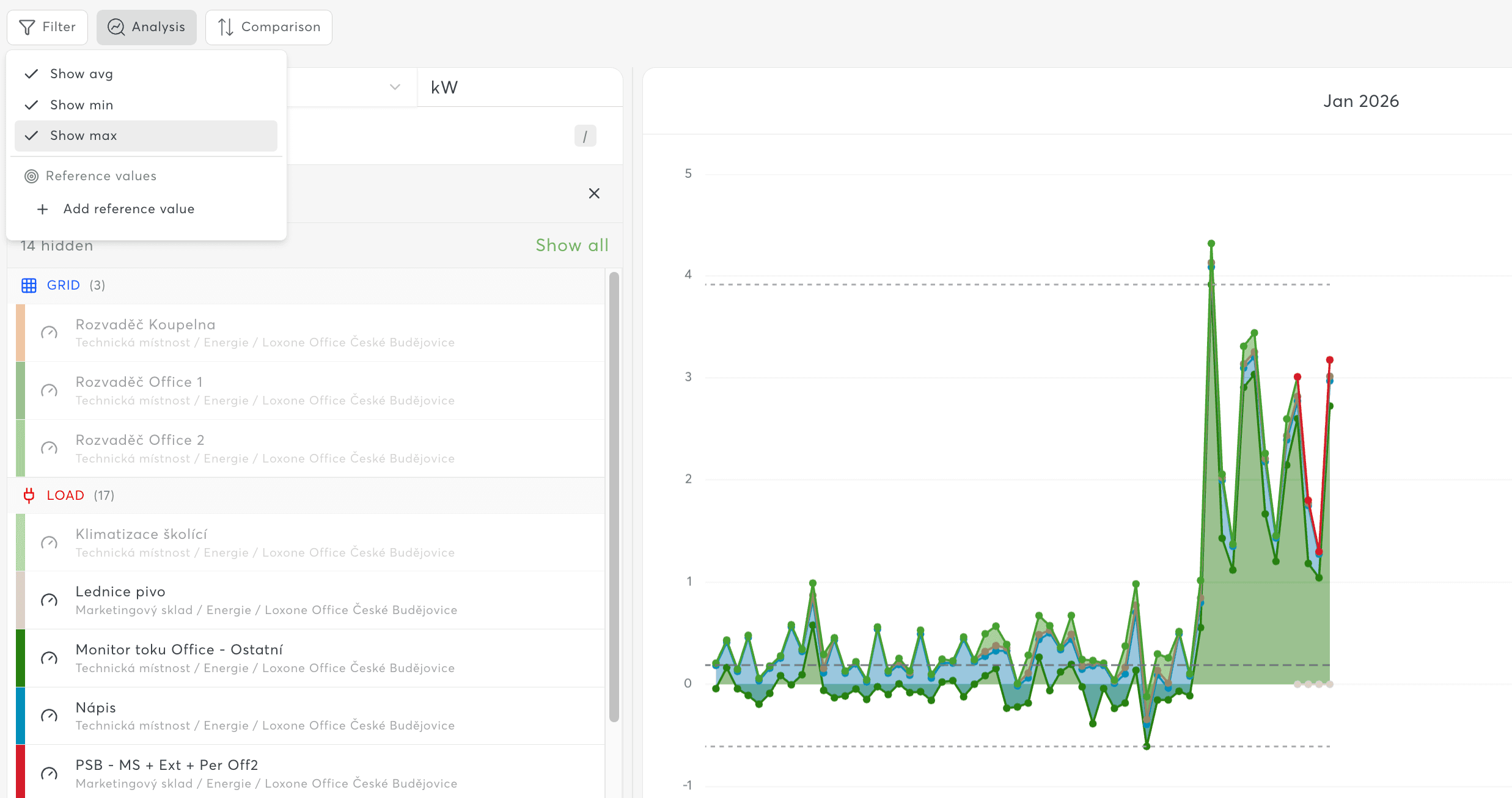
Display statistical reference lines on your chart:
- Average (avg) – Mean value across the time range
- Minimum (min) – Lowest recorded value
- Maximum (max) – Highest recorded value
Toggle these in the chart settings to add context to your data.
Reference Values
Add custom reference lines for goals or thresholds:
- Open chart settings
- Navigate to Targets
- Add a target with:
- Name – Descriptive label
- Value – Numeric threshold
- Color – Line color
- Multiple targets can be added per chart
Period Comparison
Compare current data against previous periods:
| Comparison Type | Description |
|---|---|
| Year over Year (YoY) | Same period last year |
| Month over Month (MoM) | Same period last month |
| Quarter over Quarter (QoQ) | Same period last quarter |
| Week over Week (WoW) | Same period last week |
| Day over Day (DoD) | Same time yesterday |
| Previous Period | Immediately preceding period |
Display Modes:
- Overlay – Show comparison as dashed line
- Side by Side – Adjacent bars/areas
- Absolute Change – Show difference value
- Percent Change – Show percentage difference
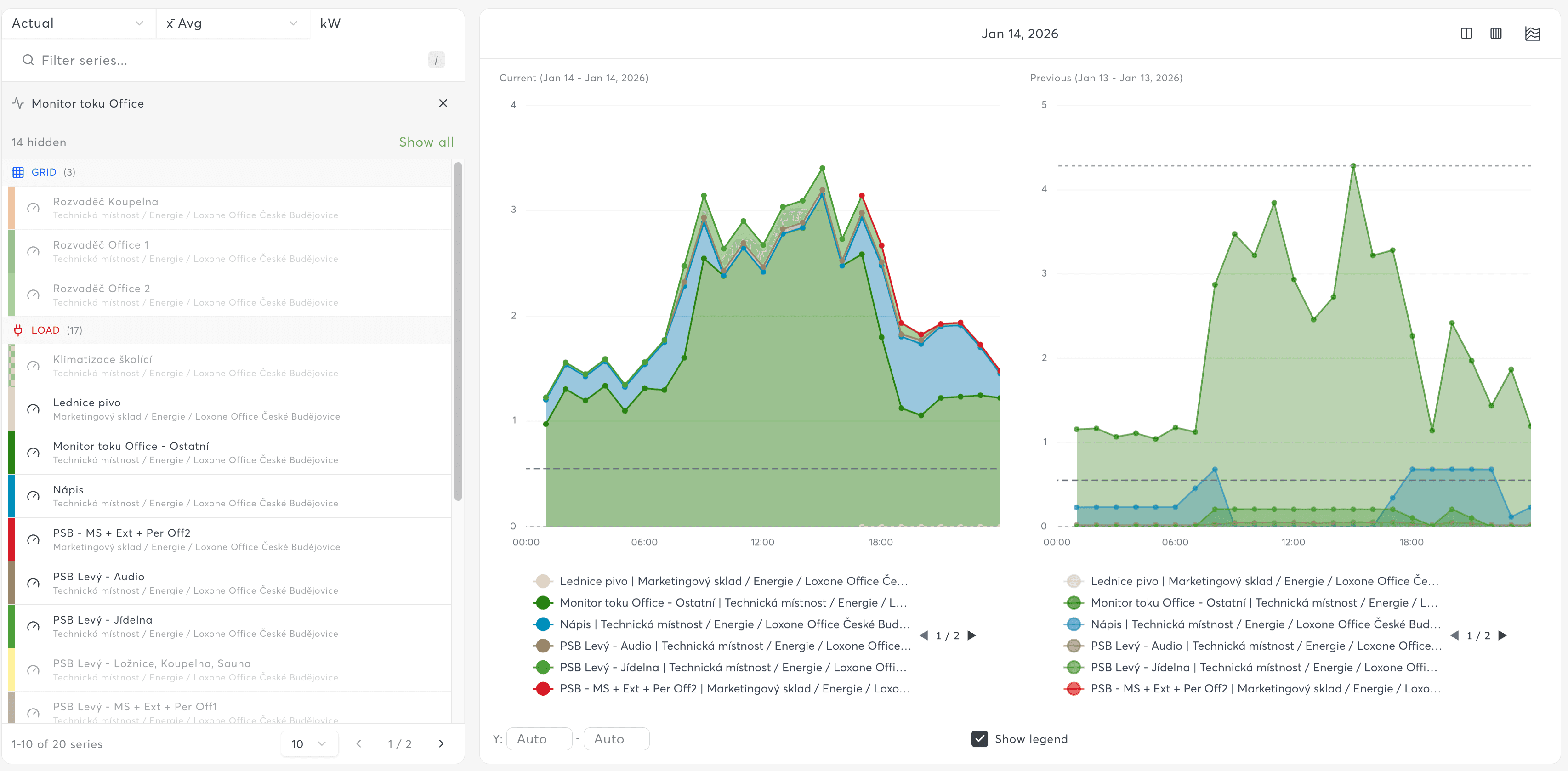
Period comparison requires historical data from the comparison period. If you recently connected the device, Year over Year comparisons won't have data. Use shorter comparisons (Week over Week) until more history is available.
Data Filtering
Series Filters (Data Filters Bar)
Filter which series are displayed based on aggregated values:
| Filter Type | Description | Example |
|---|---|---|
| Top K | Show top N series | Top 5 consumers |
| Bottom K | Show bottom N series | Lowest 3 temperatures |
| Threshold | Filter by value comparison | Show only > 100 kWh |
Threshold Operators: >, <, >=, <=, ==
Aggregation Options: avg, sum, min, max, last, first, count
Gap Handling
Configure how missing data is displayed:
| Behavior | Description |
|---|---|
| Show gaps | Display breaks in the line where data is missing |
| Fill with zero | Replace missing values with zero |
| Interpolate | Estimate values between known points |
Gap Threshold Multiplier: 2x, 4x, 8x, or 16x the resolution
- Determines when gaps are considered "missing data" vs. normal intervals
If unexpected zeros appear in your data, change gap handling from "Fill with zero" to "Show gaps". This prevents missing data from being misrepresented as zero values.
Exporting Data
CSV Export
CSV export is only available for Table charts.
- Open a chart with the Table chart type
- Click the Export CSV button in the table toolbar
- The CSV file downloads immediately with the current table data
The export includes all visible columns and rows, with timestamps in ISO format. The filename automatically includes the current date.
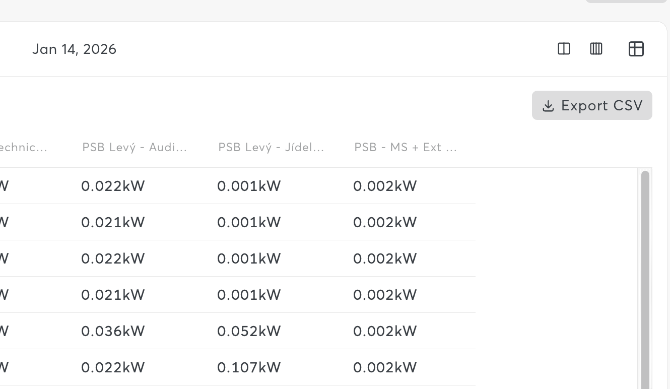
Large exports (>100,000 rows) may take several minutes to generate. For very large datasets, consider using the Export Center or scheduling a report instead.
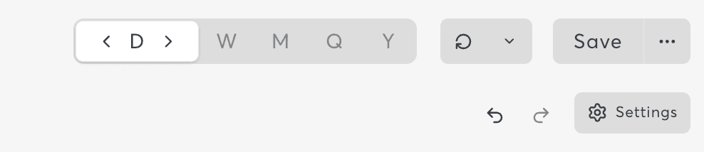
Chart Toolbar Features
The chart toolbar provides quick access to common actions:
| Control | Function |
|---|---|
| Time Range Display | Shows current bucket and date range |
| Resolution Zoom | Increase/decrease data granularity |
| Auto-Refresh | Toggle automatic data refresh |
| Refresh Countdown | Shows time until next refresh |
| Manual Refresh | Immediately reload data |
| Export | Download chart data as CSV |
| Undo/Redo | Reverse or repeat recent changes |
Auto-Refresh
Enable automatic chart refresh for real-time monitoring dashboards.
Available Intervals:
- 5 seconds (real-time monitoring)
- 30 seconds
- 1, 5, 10, 30 minutes
- 1 hour
Requirements:
- Device must be online
The refresh countdown timer shows when the next update will occur.
For lobby displays or control room dashboards, combine auto-refresh with fullscreen mode for an always-current status display.
Statistics Recording
Backfill Statistics
For sensors that don't have historical data, use the backfill feature:
- Select sensors missing data in the chart
- Click Backfill Statistics in the toolbar
- The system retrieves historical data from the Miniserver
Backfill depends on the Miniserver having the data available. Data older than the Miniserver's retention period cannot be recovered.
Live vs Statistical Data
Charts can display two types of data:
| Type | Source | Update Frequency | History |
|---|---|---|---|
| Live Data | Real-time from Miniserver | Instant | Current value only |
| Statistical Data | Recorded statistics | Per recording interval | Full history |
The chart header indicates which mode is being displayed.
Best Practices
Performance Optimization
| Time Range | Recommended Resolution | Max Series |
|---|---|---|
| < 1 hour | 1 minute | 10 |
| 1 hour - 1 day | 5-15 minutes | 8-10 |
| 1-7 days | 15-30 minutes | 6-8 |
| 7-30 days | 1-3 hours | 5-6 |
| > 30 days | 1 day+ | 3-5 |
Chart Organization
- Keep charts focused – 5-8 series maximum for readability
- Use consistent colors – Same sensor = same color across charts
- Name descriptively – Include location or purpose in chart name
- Group in dashboards – Combine related charts for context
Troubleshooting
For common chart issues and solutions, see the Charts Troubleshooting Guide.
Quick Fixes
| Issue | Solution |
|---|---|
| No data showing | Check device connection and statistics configuration |
| Chart loading slowly | Reduce resolution or number of series (see performance tips) |
| Real-time not updating | Verify device is online and auto-refresh is enabled |
| Wrong values displayed | Check sensor type selection (Live vs Statistical) |
Related Features
- Chart Configuration – Series settings, Y-axis, value mapping, layering
- Dashboards – Combine multiple charts into unified views
- Export Center – Export chart data and schedule automated reports
- Value History – View data in tabular format
- Data Selection – Find and select datapoints